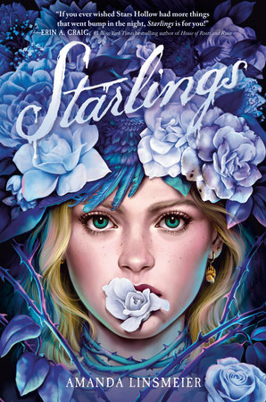
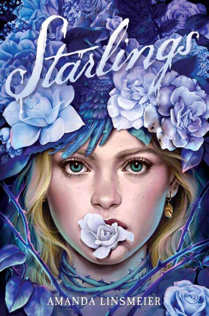
We are obsessed with the book cover for Starlings by Amanda Linsmeier, which is why we were so excited when Trisha Previte (designer, YA covers team) shared with us what it was like bringing that cover to life from idea to final product. Keep reading for a behind-the-scenes look at the journey from early cover sketches to the gorgeous cover design for Starlings!
1) Can you give us some insights into your design process for Starlings?
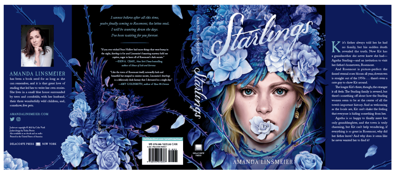
Starlings is a dark, romantic folk horror tale, and we wanted the cover to convey a feeling of twisted beauty, toxic romance, and Faustian bargains. The author sent over this awesome Pinterest board to give us a sense of the mood and setting (think Stars Hollow meets Midsommar), and Colin Verdi’s work immediately came to mind. His style hits an intersection of gorgeous and grotesque that felt perfect for this story, where the beautiful nature of a small, rose-filled town hides a dark secret. (Check out his website and his Instagram.)
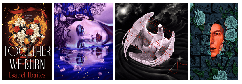
We had two different concepts in mind from the start. The first was a starling (representing our main character, Kit Starling) being strangled by roots or roses or thorns. For the second option, we wanted a human element. We envisioned our main character with a flower crown, or with flowers taking over her face. I sent Colin these incredibly rough thumbnail sketches as a starting point.
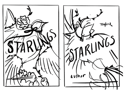
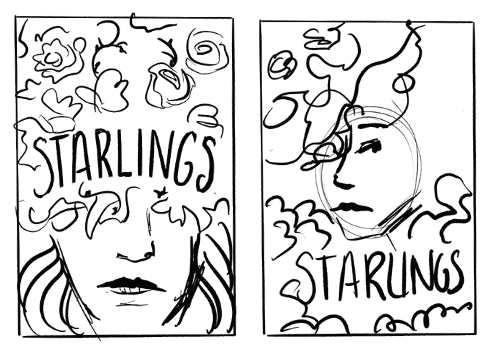
It’s a credit to Colin’s skills that he was able to translate those into these sketches.

From here, we narrowed it down to two options with some changes. We shifted to a purple and blue color palette to bring in an ethereal feel and mimic the iridescent nature of a starling’s feathers, like these.
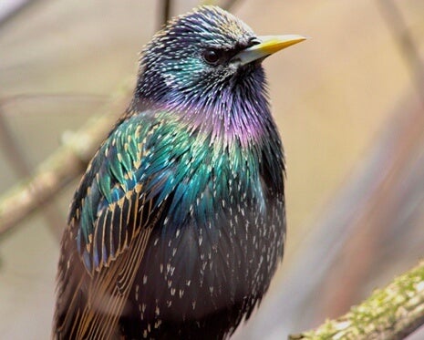
We also asked Colin to make the bird appear more frantic. For the second concept, we added the idea of a flower coming out of Kit’s mouth and thorns creeping around her neck to up the horror element. Here are the revised sketches we brought to our strategy meeting, which is where designers share concepts with the sales, marketing, publicity teams to get their input.
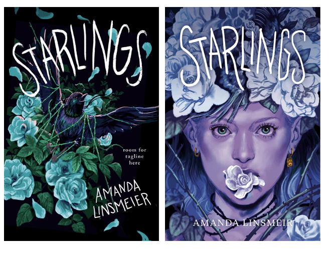
Admittedly at this point I was rooting for the bird option, but the room ultimately decided having a human element was a bigger draw. There were also some further adjustments to make. Kit was feeling a bit too elven, and we didn’t want this reading too fantasy, so we asked Colin to soften her features and switch to a more standard color palette for her face. For the final title treatment, I played with some inky, drippy script for a “signing a deal with the devil” vibe to land on our final cover!
2) Are there aspects of the story that you identify with, and how did that influence your creative decisions?
I’m a big fan of folklore, fairy tales, and all things foreboding and dark, so Starlings was right up my alley from the start. I naturally gravitate towards surreal imagery featuring flora and fauna, so the artist search was relatively easy because I already had so many artists in that vein bookmarked. And as a Gilmore Girls fan, I also perked up when the editor described the small town as a “Stars Hollow.”
3) Does this book have any special or unusual design elements you want to highlight? (ex. Special effects, hidden meaning in design elements, a new illustrator you discovered . . .)
I love that we were able to use the starling from our other cover concept on the back cover. Colin worked his magic to adjust it and did an incredible job weaving the thorns and flowers onto the rest of the jacket to tie it all together.
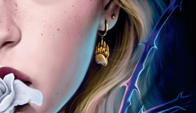
I also love that he included a little bear claw earing on our main character as a nod to Bear, a character about whom there’s a little more than meets the eye. . . .
4) What or who is your biggest creative inspiration at the moment?
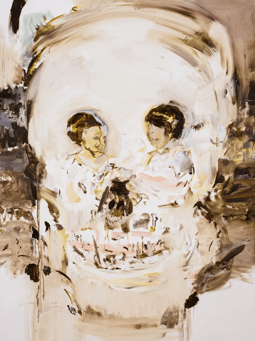
I’ve seen a lot of great museum exhibitions this year. I’m still thinking about the Edward Hopper show at the Whitney, and If you haven’t seen the Cecily Brown exhibit at the Met, I highly recommend! The show is called “Death and the Maid” and this painting, titled Aujourd’hui Rose, was one of my favorites. It features two little girls playing with a puppy, which from a distance forms a memento mori–style skull. Beautiful yet creepy, just like Starlings!
