What goes into creating the cover of one of the most anticipated romantasies of the decade? Get a behind-the-scenes look at the making of the gorgeous cover for The Last King of Faerie, book one in The Wicked Powers, the final, stunning trilogy of The Shadowhunter Chronicles.
Learn more below from the book cover design team: Liz Dresner (art director), Casey Moses (assistant art director), Trisha Previte (senior designer), and Christina Chung (designer).
1. Was there anything special or unusual about designing the cover that you want to highlight?
Liz:
Designing a cover can be a solitary process. Although there is always collaboration—especially with the editor—the designer is often spending long periods working by themself, emerging from their design cave to get feedback, then immersing themself again to figure out how to address the notes they received. This project was the opposite.
We had not one, not two, but four designers on The Last King of Faerie. Casey and I co-designed the cover and conceptualized the full packages together, talking constantly and switching whose turn it was to write art notes. Trisha and Christina came on board to tag team the cases for us. We also have to give a shout-out to editor, Michelle Frey; managing editor, Jake Eldred; and production managers Liz Sutton and Tim Terhune—not to mention all of sales, marketing, and publicity. Sometimes, it truly takes a village!
2. Can you give us some insights into your design process for The Last King of Faerie?
Casey and Liz, on the full package:
There are many components that can go into a book’s overall package: the jacket, of course, but also endpapers, case art, and edges. We knew from the beginning that Last King of Faerie would get at least some extras (Spoiler: it ended up getting all the extras!), but to begin we focused on the jacket.
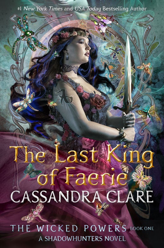
This book kicks off the last trilogy of Cassie Clare’s Shadowhunters series, so we knew we wanted to keep the iconic Shadowhunters look by working with Cliff Nielsen who has done the art for every book in the series. Michelle (the editor) consulted with Cassie and let us know that they agreed Dru should be the featured character. Cassie suggested showing Dru in profile with art deco elements.
Looking at Cassie’s backlist, we brainstormed ways to make this new series stand out by changing up the character’s pose, size, and cropping. Many previous Shadowhunter books feature a limited color palette, and we saw an opportunity to amp up different colors in this one, packing in as many jewel tones as we could. This ultimately helped us unite the different components of each edition with unique colorways later, too.
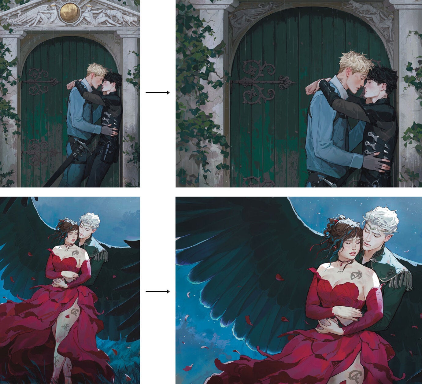
Cliff starts with black and white sketches before doing a photo shoot for the final art.
He sent this stunning first round in:
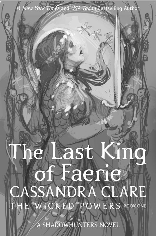
With a couple of revision notes from us, we landed on this approved sketch:
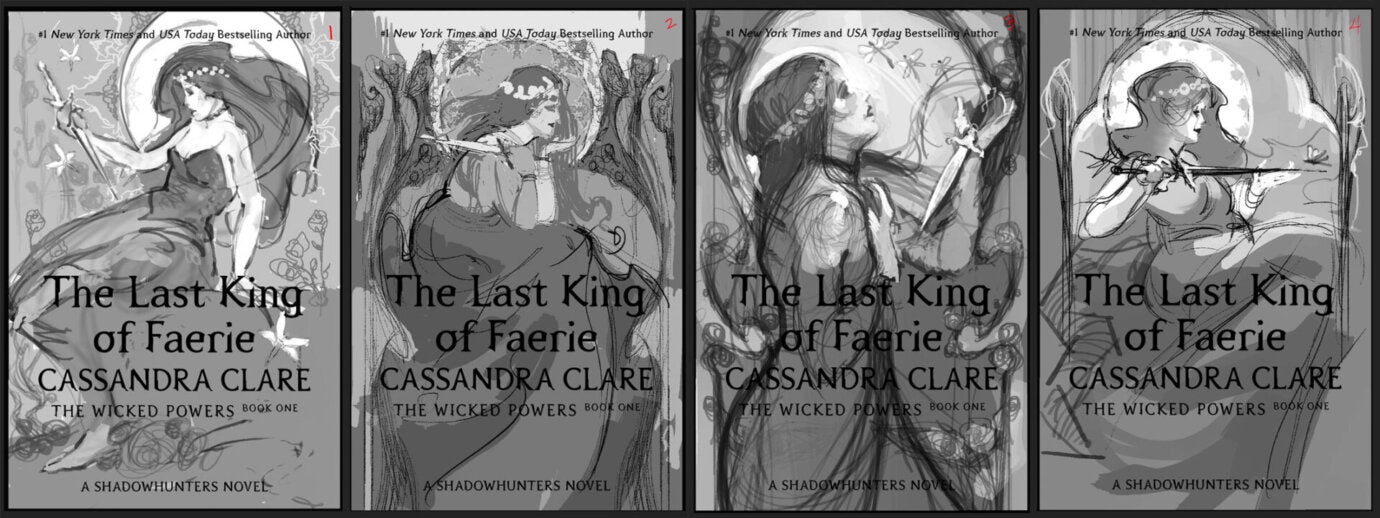
Then it was time to pick a model! Cliff sent four great options, which we shared with Michelle and Cassie:
Cliff worked his magic from there, resulting in the gorgeous final cover:
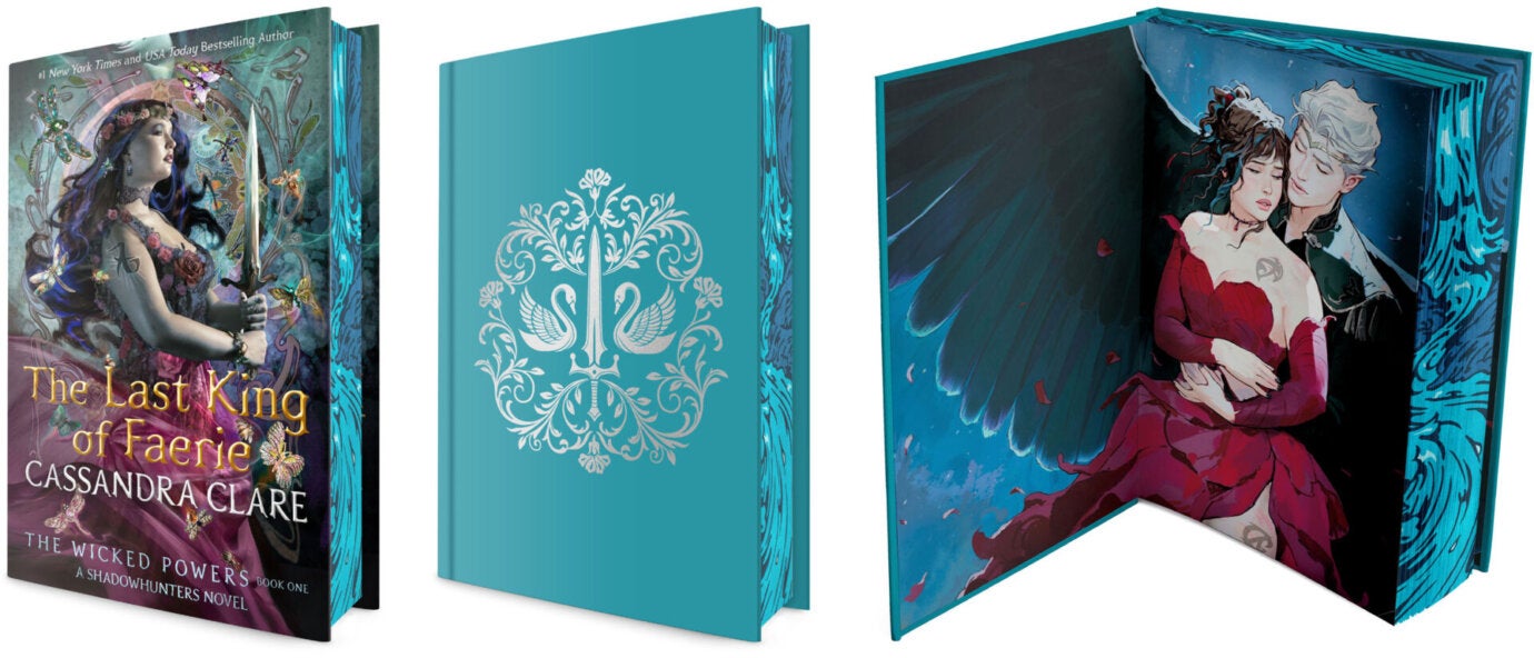
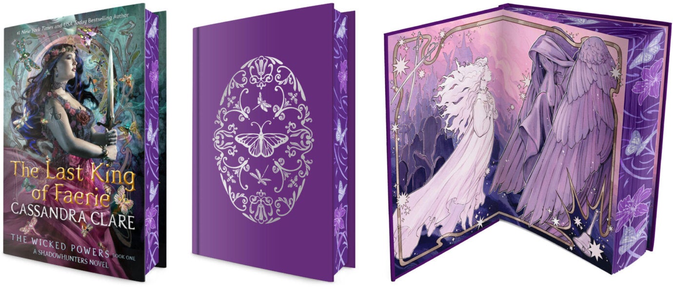
Now, for the other components . . . Coming out of launch, we knew that B&N, Target, and Walmart were all considering exclusive editions, and we started planning immediately.
The most common jacket changes for exclusive editions are color shifting the art and adding specs (glitter or foil, for example). However, we don’t do color shifts for Cassie Clare because this is a series with a lot of books, and we don’t want to pick up a color from a previous title or limit what colors we have available in the future. The trade jacket prints over metalized stock with spot gloss and embossing, so we match that across all editions for series consistency.
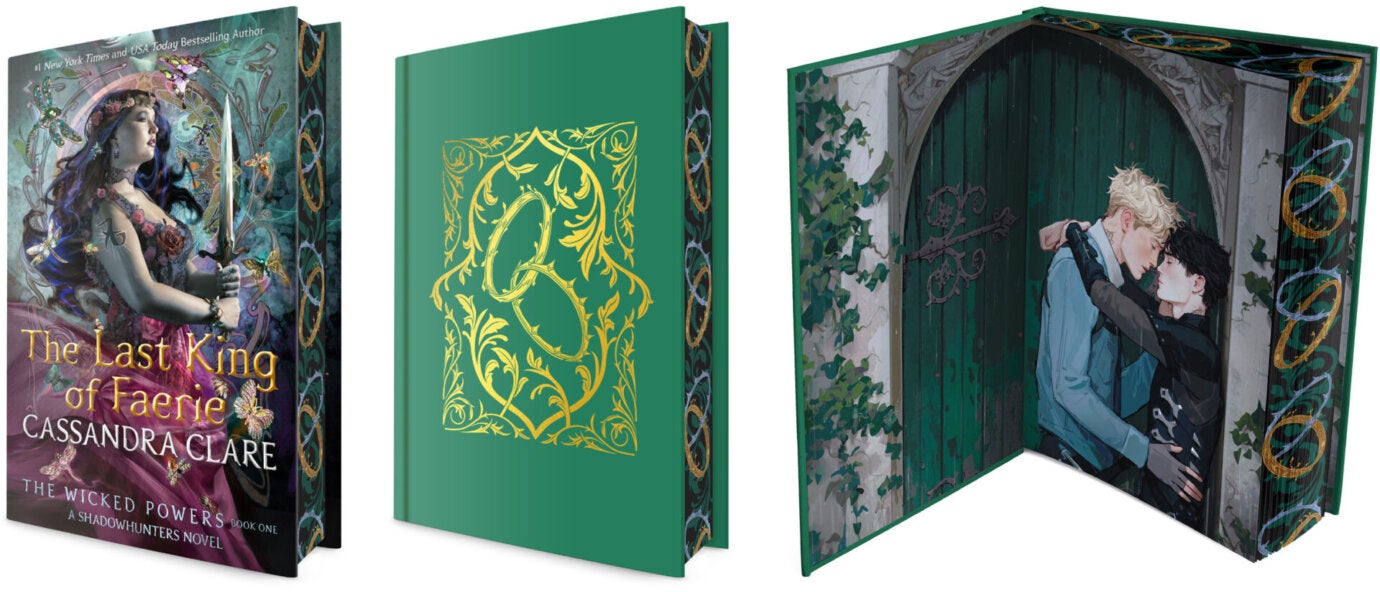
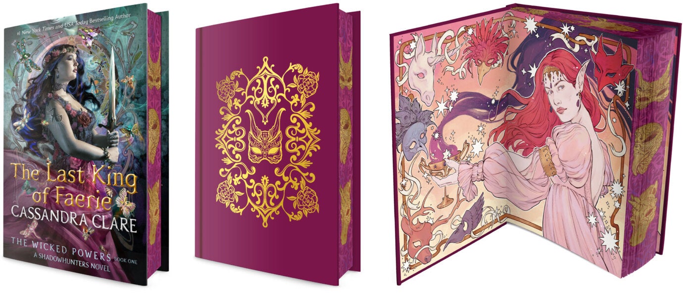
Since we had to keep the art and effects on the jacket the same across accounts, the edges, endpapers, and cases needed to do the work of making each edition worth collecting.
Endpapers provide a great opportunity to show characters who might not make the cover, especially fan favorite villains like the Seelie Queen or characters who died in previous books but are still beloved like ghost Livvy. The Shadowhunter books are also known for the romances that everyone loves to root for, so we love highlighting those relationships here, especially queer couples.
Cassie had already commissioned Dru & Ash and Kit & Ty as promotional art from Frostbite Studios when we were conceptualizing endpaper options. She gave them to us to use. Frostbite made a few adjustments so the original vertical pieces would work as horizontal compositions for the endpapers, and voilà!
That took care of the trade and one exclusive edition, but we needed two more! We’d commissioned Addie Kincelle for the Better in Black endpapers with stunning results, so we turned to her for the remainder. We brainstormed Seelie Queen and Livvy ideas with Michelle before briefing Addie. She then sent these beautiful sketches, and we selected the two on the right:
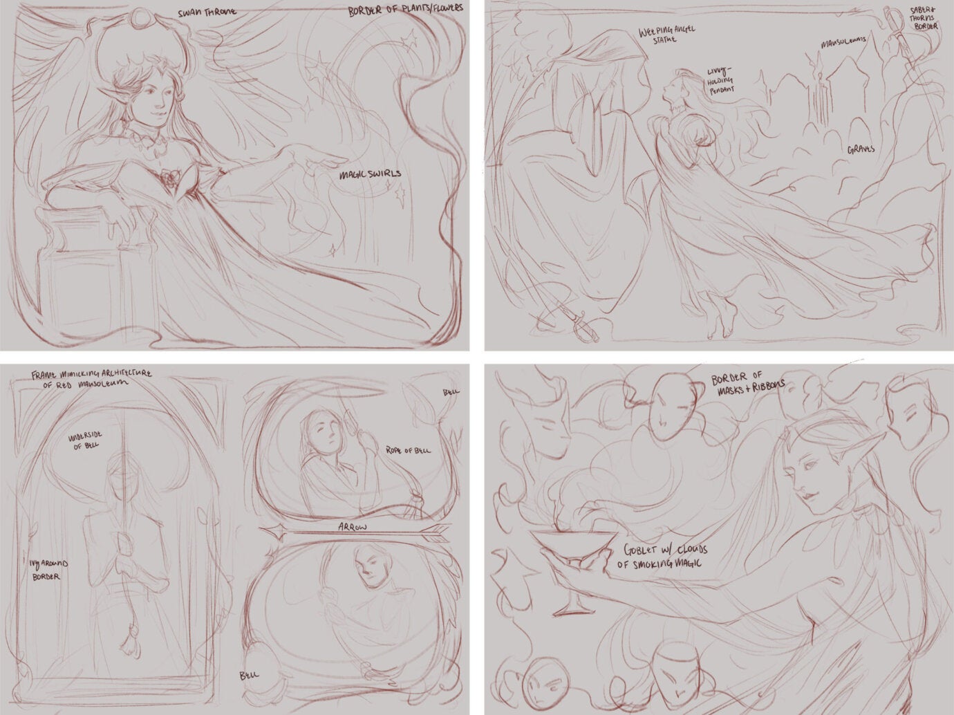
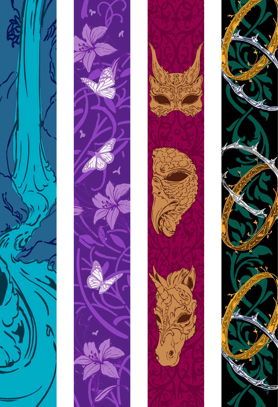
While Addie was sketching, we turned our attention to edges. We’d seen some gorgeous covers illustrated by Niall Grant recently and thought his art would elevate these packages even more. We showed Michelle and Cassie these samples, and they agreed Niall would be perfect:
Brainstorming time again! Between Michelle, Cassie, and us, we came up with four different edge ideas: an indoor waterfall in Faerie, insects and flowers inspired by the cover, the masks from a Faerie ball, and interlocking Faerie crowns. Niall executed all of them brilliantly; we couldn’t believe these were first round sketches:
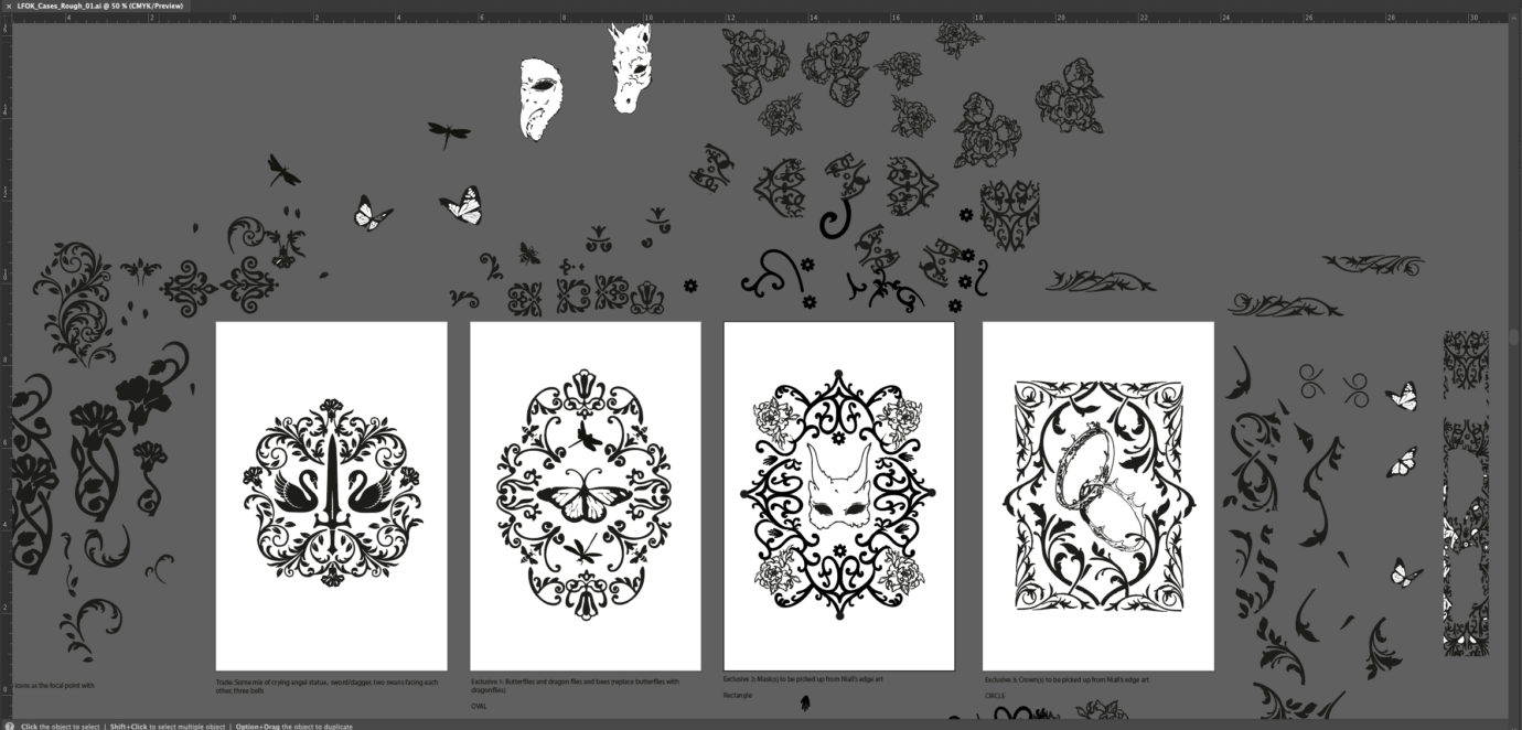
Last but not least, we needed beautiful, intricate art to be foil stamped on the cases. Enter Trisha, who created the fantastic Better in Black case stamps.
Trisha, on sketching the case stamps:
These case stamps are always a blast to work on—they’re essentially a giant puzzle, with key motifs from the books and a variety of decorative filigree working as my puzzle pieces. Casey and Liz provided starting points, suggesting daggers, swans, bells, butterflies, dragonflies, masks, etc. They also shared the edge art sketches, so I dropped those into Adobe Fresco and used a vector brush to make an assortment of decorative elements.
Once I had a collection of my “puzzle pieces,” I brought everything into Illustrator to build each stamp. I usually start by planning a loose shape for each central image to sit in, i.e. a mask in a square frame, swans in a circular frame, etc. It’s a lot of tinkering and moving pieces and parts. Sometimes I go back into Fresco and make new elements or edit elements directly in Illustrator as I find areas that need finessing. It’s a matter of balancing the overall shape with the white space and level of details across all four case stamps, so each one feels of a piece with the others but still unique. Here’s a look at my very messy pasteboard during the process.
The art in the white rectangles is what I showed Liz and Casey for the first round:
Casey and Liz:
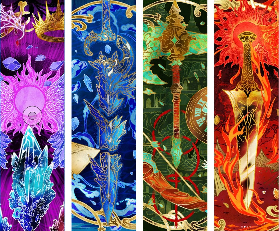
Now, we had at least in-progress visuals for all our components, which meant it was time to get them in front of accounts so they could make their selections. We took inspiration from the jeweled insects on the cover and pitched the editions as a collection of gems with each edition getting its own jewel-tone palette: emerald, amethyst, garnet, and blue topaz. Once each account chose their gem, we shared the color palettes with our various artists so they could finalize their pieces.
Aaaand, enter Christina Chung, who jumped on the case stamps so Trisha could relax on a much-deserved vacation!
Christina, on finalizing the case stamps:
I was brought on toward the end of the process of designing the trade and exclusive editions of The Last King of Faerie and was tasked with finalizing the four case stamps based on the edge art of each colorway.
Trisha shared sketches and in-progress case stamps for me to work with as a jumping off point, and we discussed ideas and directions before I got started. It’s a unique challenge to finish a project started by someone else, but with Trisha’s help, it felt pretty seamless! For each case stamp, I made sure to reference the edge art it would be paired with as well as Trisha’s previous case stamps for the special editions of Better in Black. I wanted to make sure the case stamps were varied in level of detail and composition, while still feeling consistent and part of a full package when viewed together.
Having a foundation to build upon with Trisha’s sketches allowed me to work faster and spend more time finessing each case stamp. I used a blend of vector brushes in Fresco and Illustrator, a process which lends itself to creating intricate designs. I’m really happy with how the case stamps came out, and I’m grateful to be part of the team putting together such a gorgeous package.
And here’s our collection of gems!
3. What or who is your biggest creative inspiration at the moment?
Liz:
One of my resolutions this year is to have more art in my life! I started asking friends to museums instead of drinks, and it’s been both freeing and inspiring to just pick one based on location and go look at whatever exhibit they happen to have up. I’m seeing such a bigger variety of art than when I carefully planned my visits. Sometimes randomness is the answer!
Casey:
I recently bought my first house and just moved in! So, I’m deep into home décor and paint swatches right now to transform my gray and beige house into the rainbow home of my dreams. I’ve been pulling a lot of inspiration for a living room mural from vintage floral 70s wallpaper and color palettes that feel warm and cozy with a modern twist.
Trisha:
Lynda Barry is my current fixation right now. I recently read her books Syllabus and What It Is, and as someone trying to get back into a regular sketchbook practice, I found her takes on journaling refreshing, rather than feeling pressure-filled or trite. I also love looking at people’s journal and sketchbook spreads on TikTok and Substack. There are so many different approaches to a notebook and I love seeing people use them in ways I never would have thought of.
Christina:
Lately, I’ve been finding a lot of inspiration in animation. Some recent favorites have been the film Arco, The Gorillaz’s “The Mountain, The Moon Cave and The Sad God” music video, and even Chappell Roan’s Fortnite collab reveal trailer. Especially in the age of AI, being able to witness stunning pieces of animation created by humans who clearly care for the craft has been a huge source of inspiration and joy. Watching these helped to fill my creative cup and made me want to get up and get back to making art!