The book design of We Fell Apart is stunning—and so is the story behind it! We asked Associate Art Director Angela Carlino to share some of the process that went into creating the iconic look for the final book in this series and the matching deluxe editions. Read on for a behind-the-scenes look at how your favorite series got its iconic look!
1) Can you give us some insights into your design process for the series?
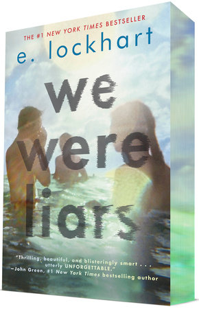
I worked on the We Were Liars cover over 10 years ago! I presented many different design directions for this cover at that time. I was so happy that this particular image and type design was chosen. Blurry and imperfect photos evoke emotion to me—I think the moody photograph I found for the cover is very fitting for this atmospheric story. I created the wind-blown title type treatment while playing in Photoshop. I seem to do my best work when I am playing. My subconscious mind is the best designer! This cover stood out in the marketplace; it is different than what was being published then and even now. There are not many blurry, imperfect photographs on book covers—especially YA book covers. I think the cover still feels fresh and relevant after all these years. The type design adds to the dreaminess—we continued to use this treatment on all 3 books in the Liars series. Here are some in-progress shots of the type creation for We Fell Apart.
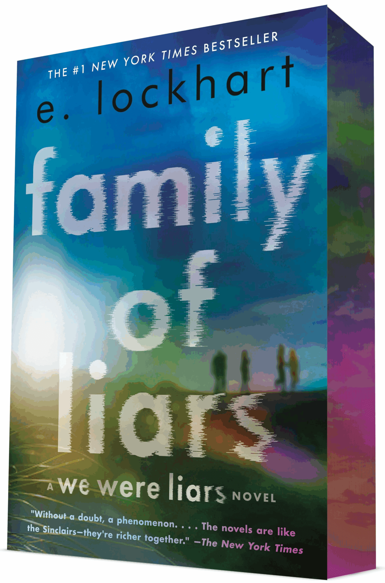
The cover art for Family of Liars was a compilation of stock photos (below). Since this story is a continuation of this family saga set on a private island / beach retreat we wanted to stay with the beach setting. To differentiate the feel of this cover I manipulated the colors to make it feel like sunset instead of the hot, high noon feel of the setting of the We Were Liars cover photo. I could not find the perfect image so I compiled a few different photos to create the final scene.


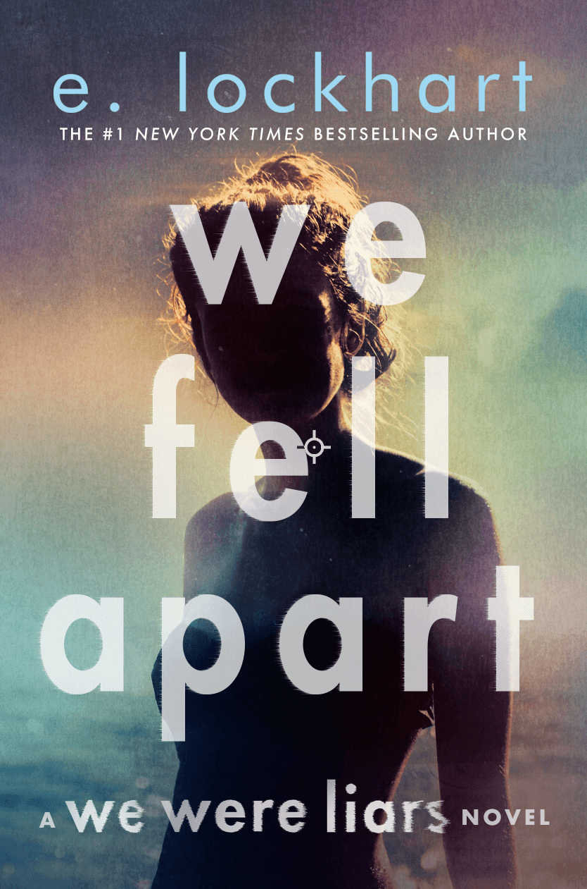
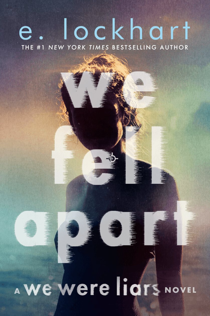
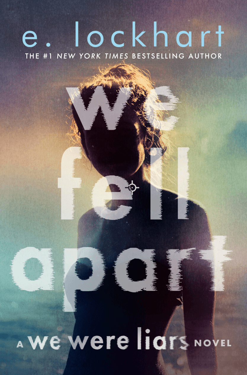
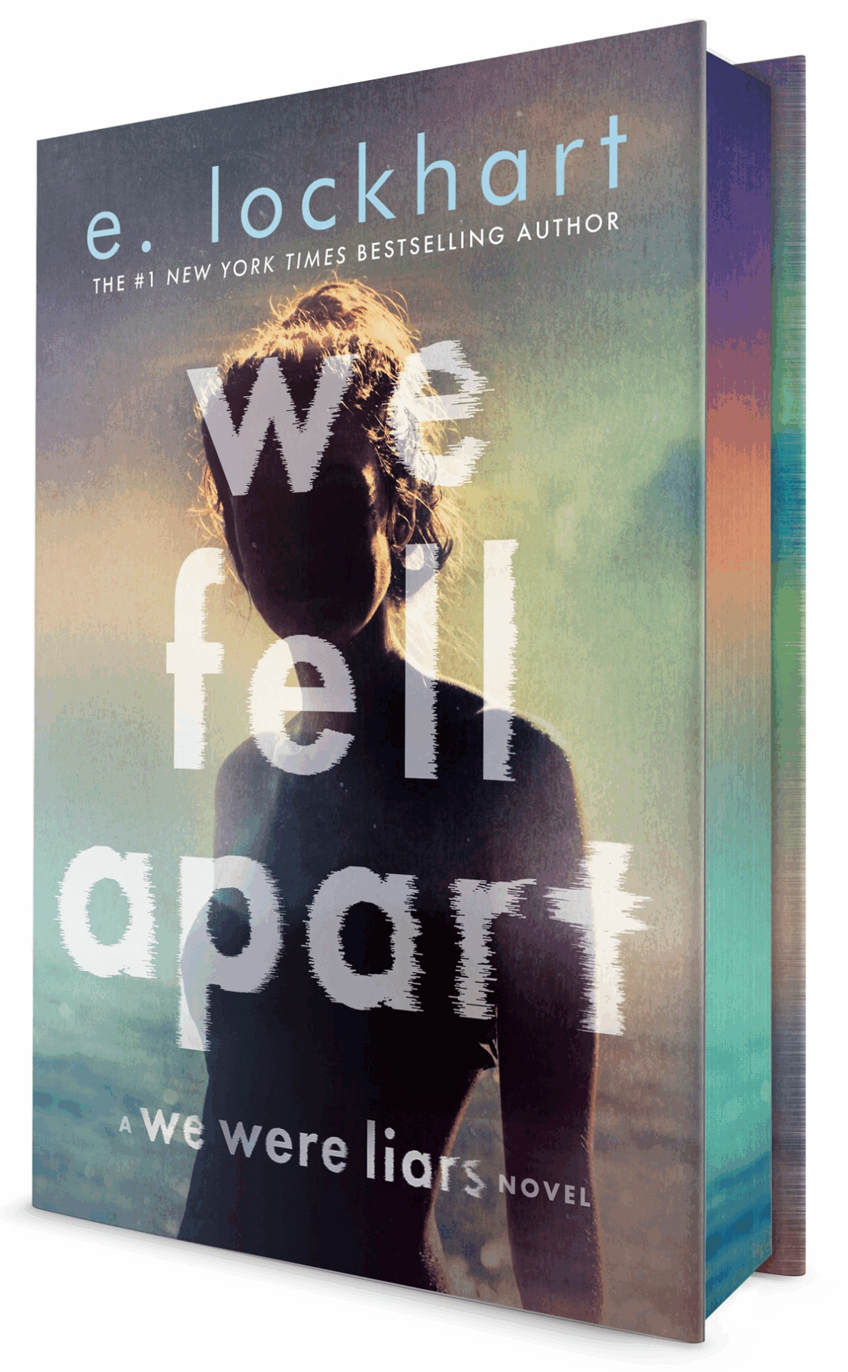
A freelancer, Elsie Lyons, helped with the photo research for We Fell Apart. We wanted to continue the iconic series look, so we asked her to look for photos with a similar mood of the first 2 books. I love the photo she found—the darkness in the figure and the missing face is unsettling yet beautiful. Her original comp had an overall greenish tint, and we asked her add the blues and purples to create mystery and depth.
2) Are there aspects of the story that you identify with, and how did that influence your creative decisions?
At the start of the design process, we are usually supplied a rough manuscript or a synopsis of the book we are working on so we know what the story is about and can make design decisions that make sense. For We Were Liars I did not get a manuscript or a synopsis—I was given very little information—I did not even know the secret ending! I knew that it was the story of a wealthy family that has a summer beach retreat and something mysterious happens. I identify with having a special family beach retreat—I was lucky to have this experience in my own life. The images on these book covers remind me of those long summer days and the special times I experienced.
3) Does this series have any special or unusual design elements you want to highlight?
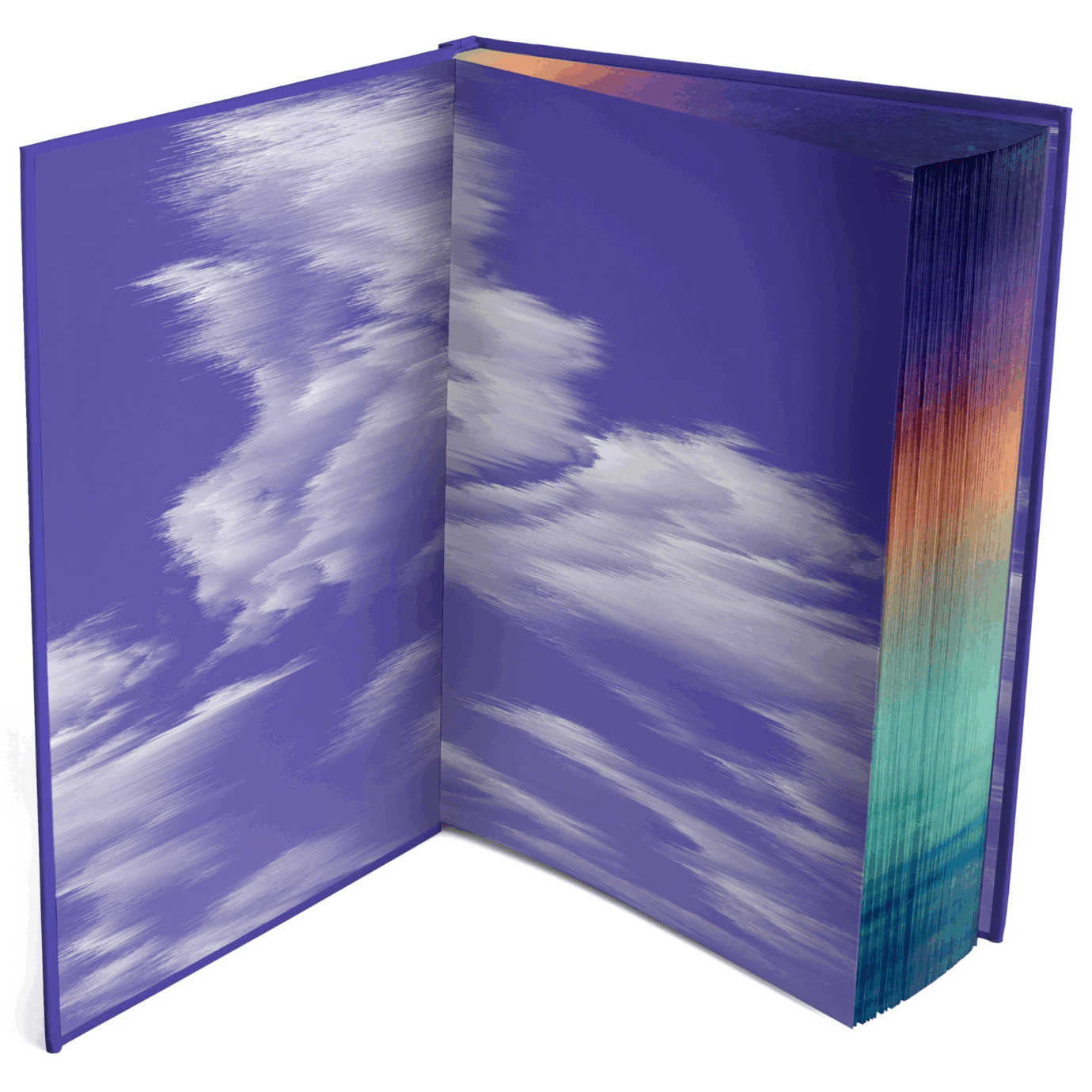
We just announced new deluxe editions with sprayed edges for all three books, plus printed endpapers and a stamped front case for the We Fell Apart hardcover!!

4) What or who is your biggest creative inspiration at the moment?
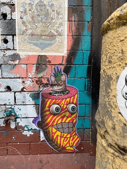
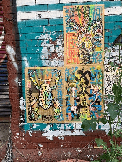
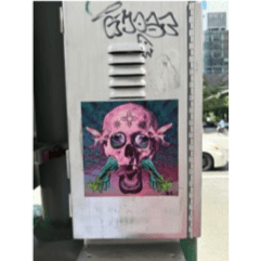
I love to look at the art and messages that are posted on EVERYTHING in NYC! The wild creativity makes me happy.