Judging a book by its cover (it’s ok we all do it) is even more fun when we know the behind-the-scenes story of the cover creation process.
Book designers spend hours, days, months perfecting every cover so that when you do judge it at the book store (really it’s ok), you can’t help but pick up the book to learn more. Here’s a glimpse into the not-so-short history behind creating the cover of A Short History of the Girl Next Door by debut author Jared Reck. The cover was designed by Ray Shappell, who walked us through the process. . .
Let’s set the stage. . .
A Short History of the Girl Next Door is the hilarious and heartbreaking story of the unrequited love of Matt Wainwright, who starts to have feelings for his best friend Tabby. He wishes everything could turn out like it does in a romcom movie, where Tabby would discover that she loves him back and they’d end up kissing in the rain.
But that’s not how it goes. Matt not only loses her heart to their high school’s basketball star, but also loses her friendship after a tragic accident. Now Matt has to put himself back together to win over the girl next door.
And now the cover design games begin!
1. Inspiration
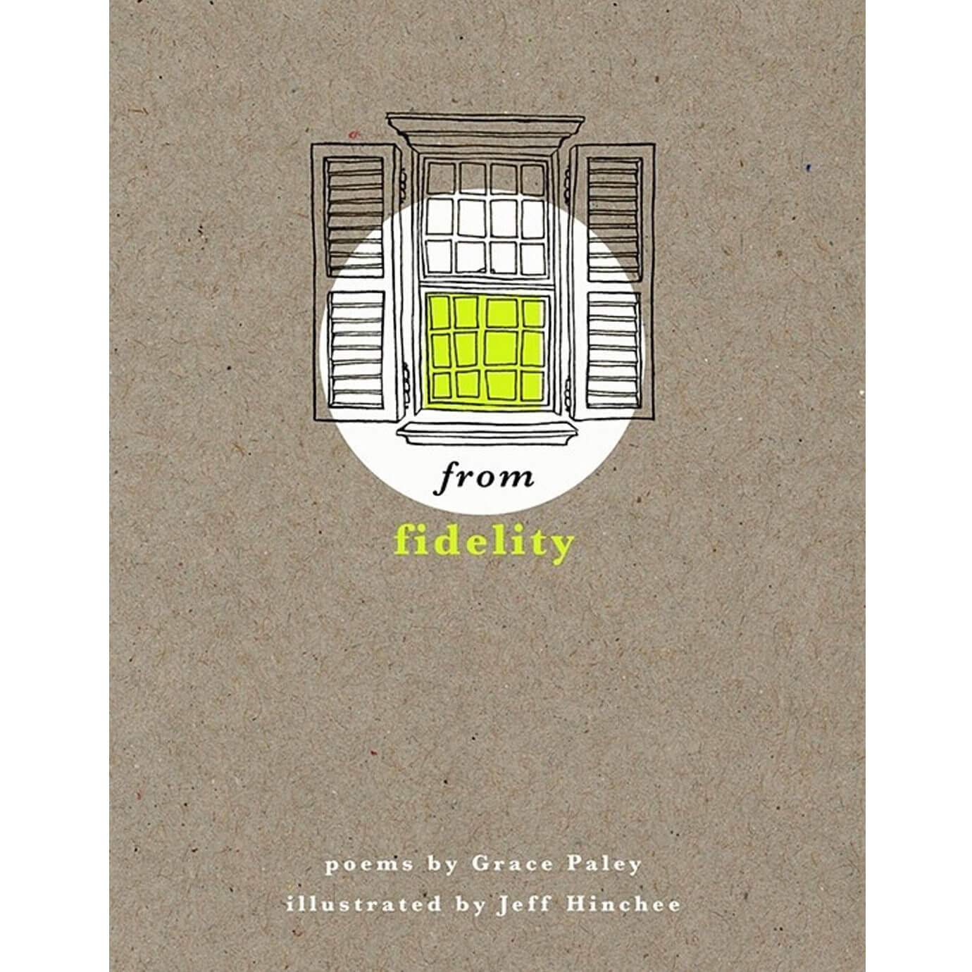
After brainstorming and testing out many ideas, this cover story really begins with this one image. This inspiration came from illustrator Jeff Hinchee. Ray, the designer, took this image to the editor, author, and other important publishing people. They all agreed that there was definitely something special about this concept.
2. Mock ups
Ray reached out to Jeff, who was happy to collaborate on this concept for the book. He created the comp image below. Now with an amazing illustrator on board, and an approved concept, Ray began to test some designs.

3. Windows on Windows ON Windows
Ray started to experiment. Even with a concept to run with, there is a lot to consider. What should the hierarchy of the elements be? What should the type look like? What should the texture be? Title over the window? Title below the window? And what about the windows themselves?
Should there be one window?
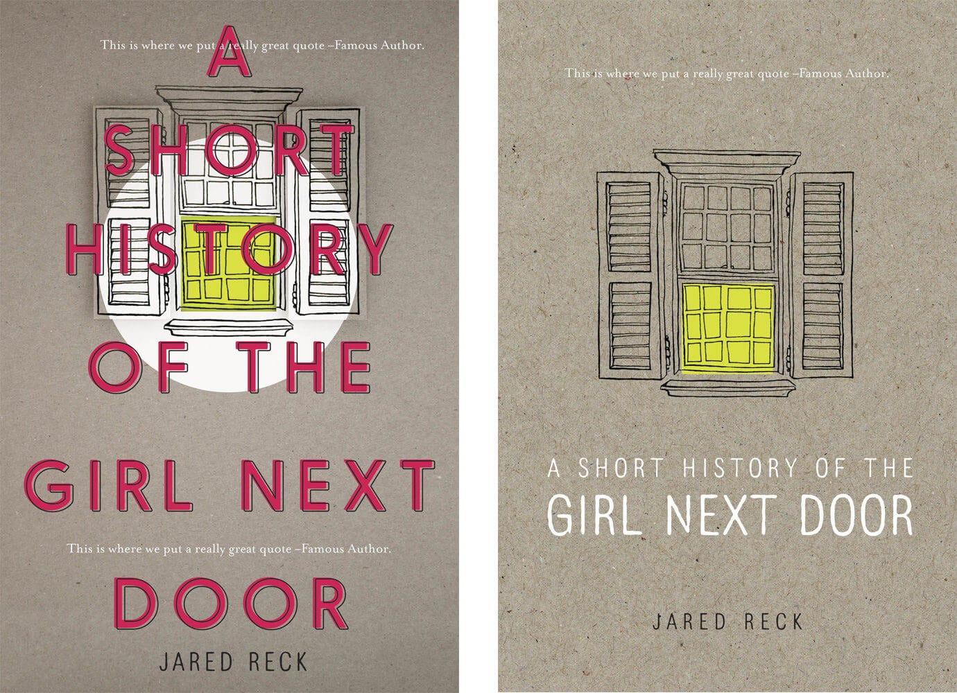
Or two windows?
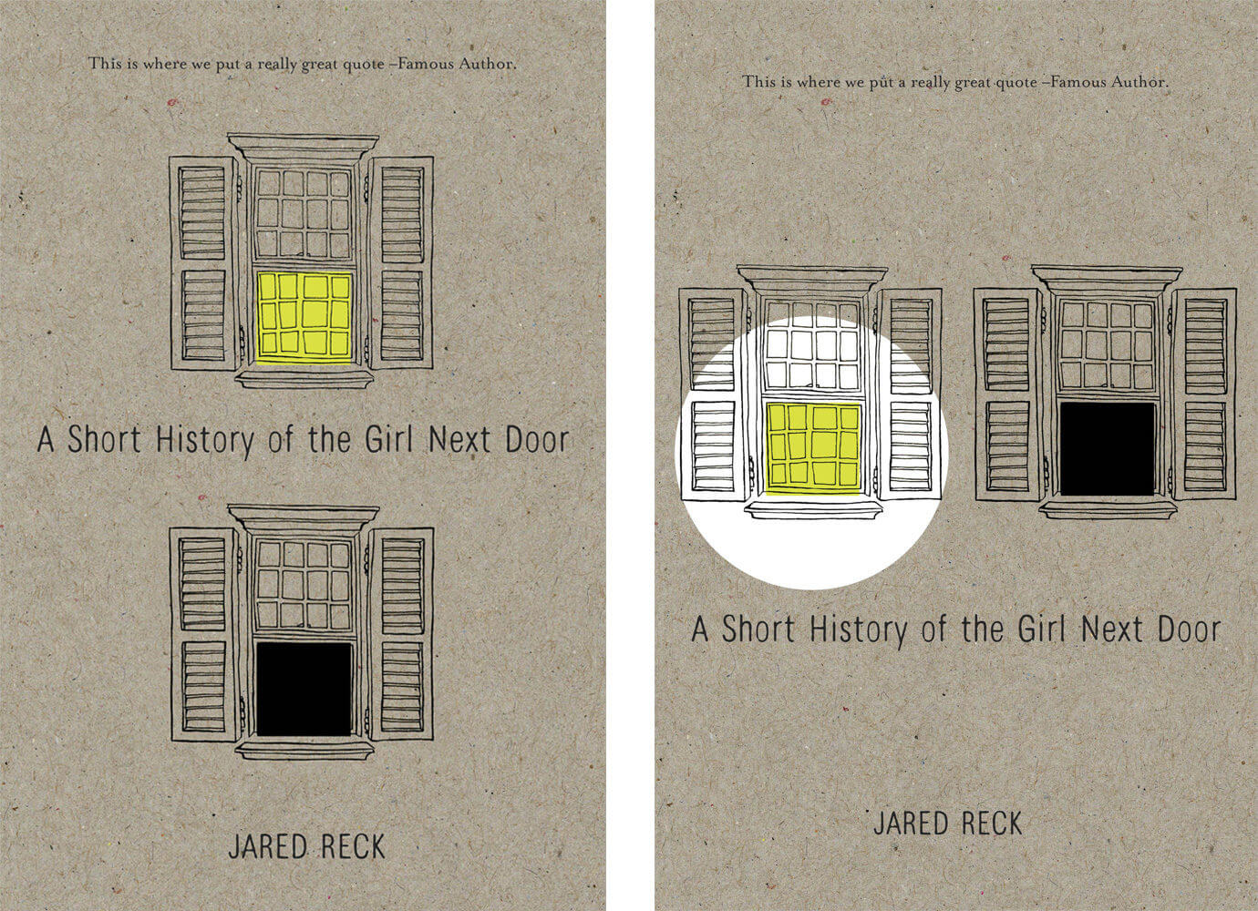
Or lots and lots of windows??

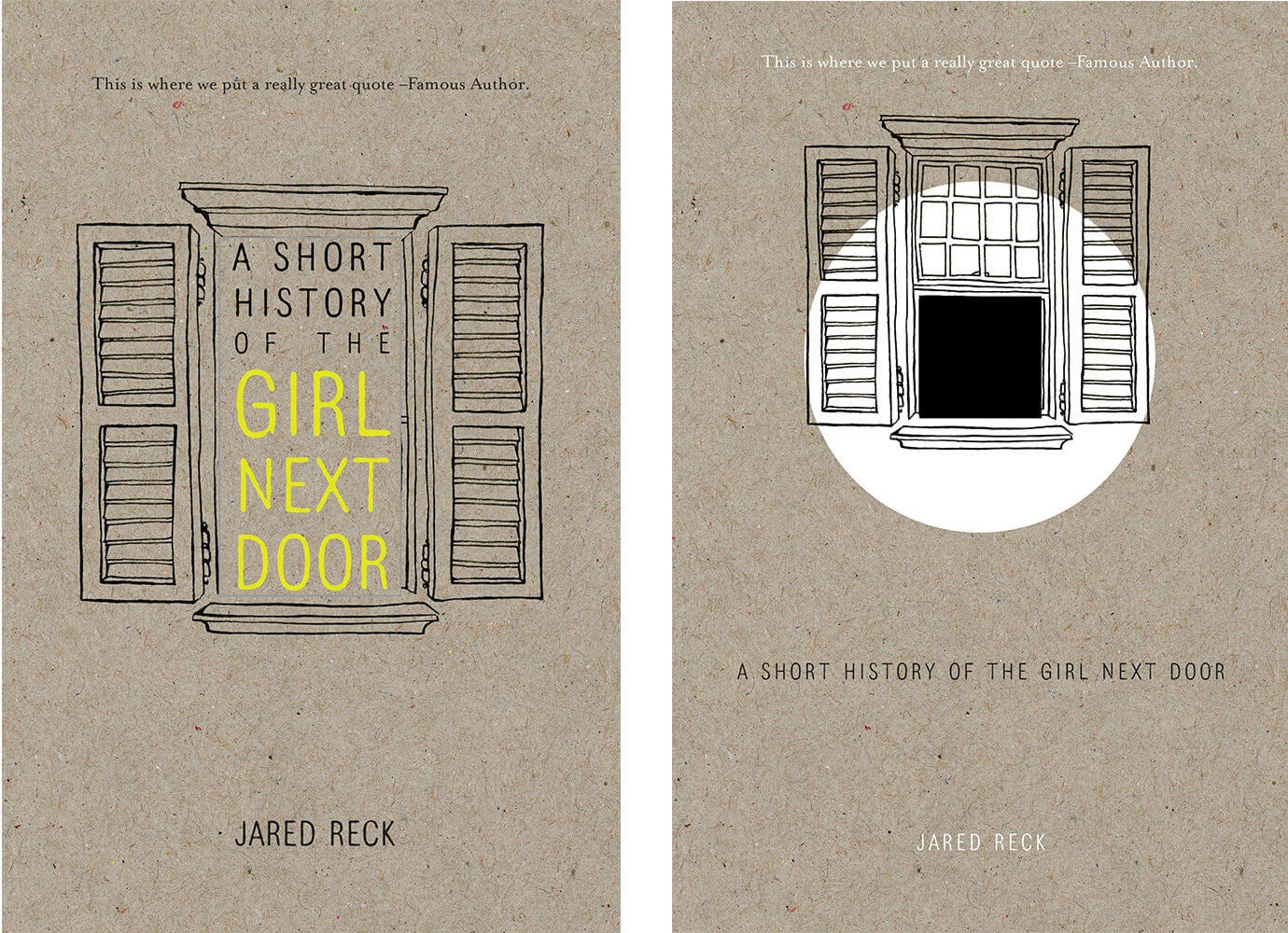
4. Color
After a lot of consideration about each design element, we’re getting closer! At this stage, Ray decided that multiple windows was the way to go. But now, what colors should be used?
How about blue?
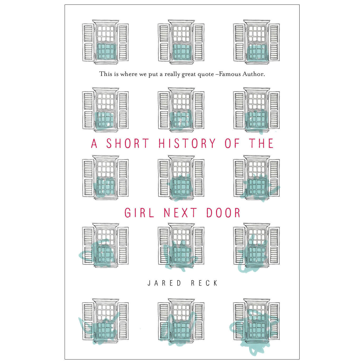
Or purple?
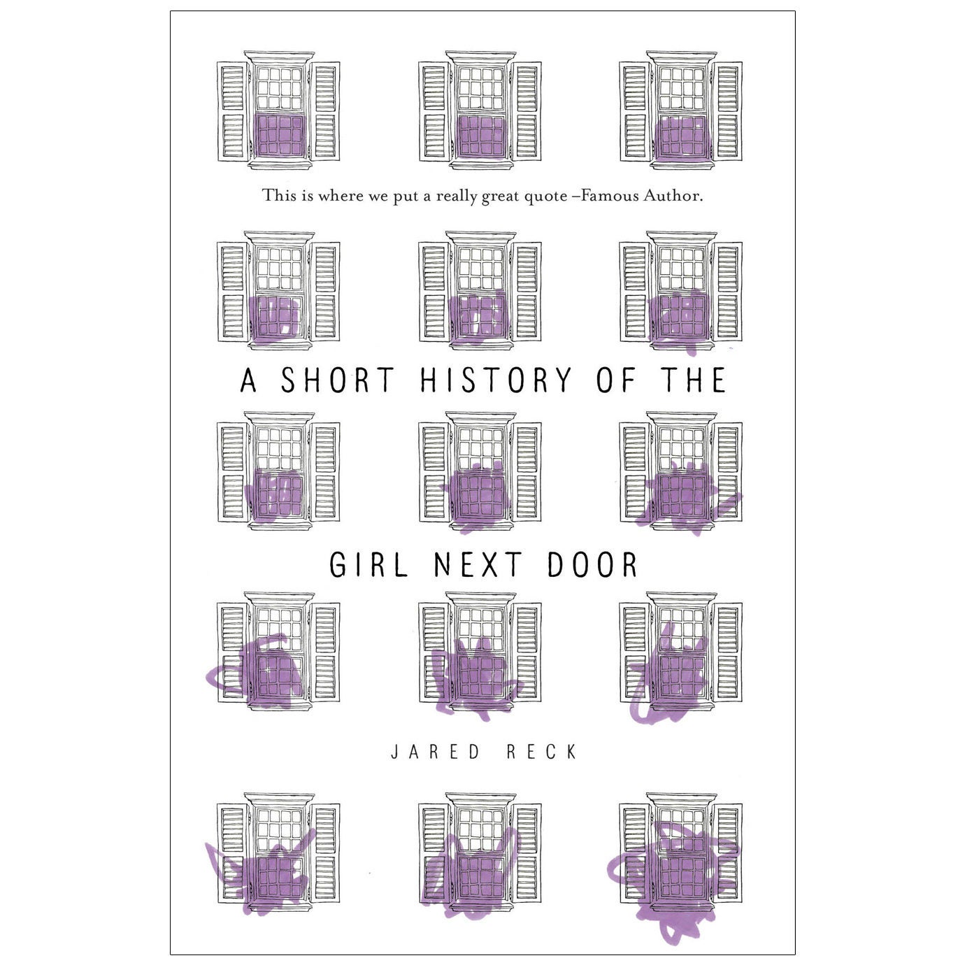
Or pink??

Or what about grellow (yellow with a hint of green)?!
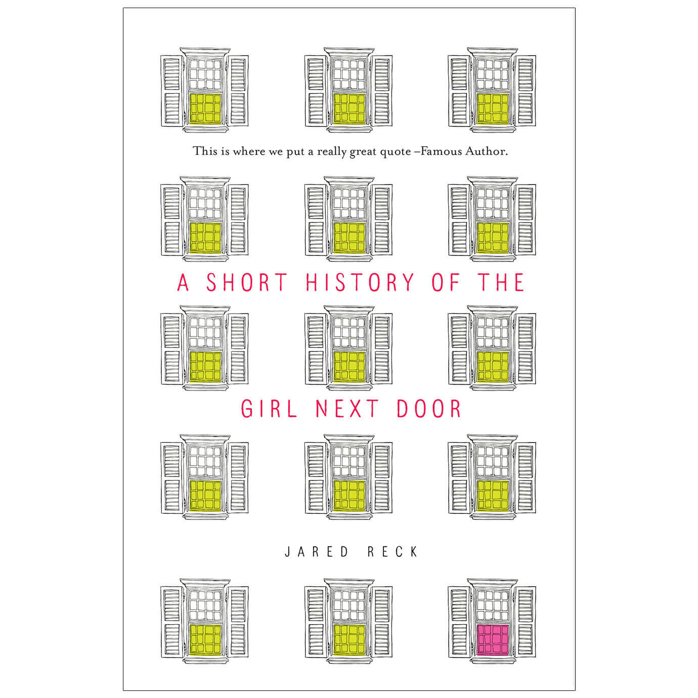
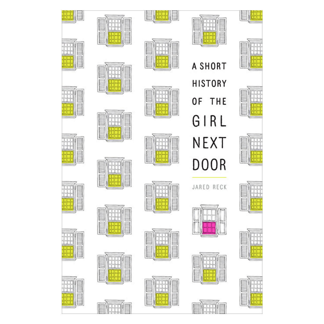
5. Pattern & Placement
Grellow and pink wins! And in the final printed book, a fluorescent ink for both the grellow and the hot pink is used so that these colors REALLY pop.
At this point in the process, Ray came down with a cold. Even in his feverish state, he never stopped thinking about the windows (serious dedication). When he was home sick, he had a dream about creating a pattern with the windows and came back to work with a new design that wowed the room. This is a true story by the way. . .
This is how we feel about it:
We asked Ray what he thought of the final product:
"I'm extremely proud of this cover! It was an amazing collaboration with the illustrator and everyone involved internally who helped make this 3AM fever dream a wonderful reality."
And then we asked author Jared Reck what he thinks of the cover and he totally agrees with us on its awesomeness.
"I am completely in love with the cover for A Short History of the Girl Next Door—that beautiful window design that tells a story all on its own—was beyond anything I could have ever imagined. It is perfect."